19 Popular Template Sections
Open the Sections panel of any site and you’ll find 19 new Sections, inspired by our most popular templates. We’ve changed things up a bit, adding animations and other new capabilities, to give you more design options and ideas.

Refresh your site with Sections
Adding new Sections to your sites is an easy way to refresh a site quickly, or build an entirely new site. And, because Sections take on many Global Design settings, it doesn't take a lot of effort to make each Section that you add look just right.
Your newest Sections may look familiar (they are hand-picked from our most popular templates), but they have some neat design variations that you won't want to miss.
Scroll down for a preview of all the new Sections, according to category. Immediately below the Sections, you’ll see step-by-step instructions for recreating the Gallery Section on your own.
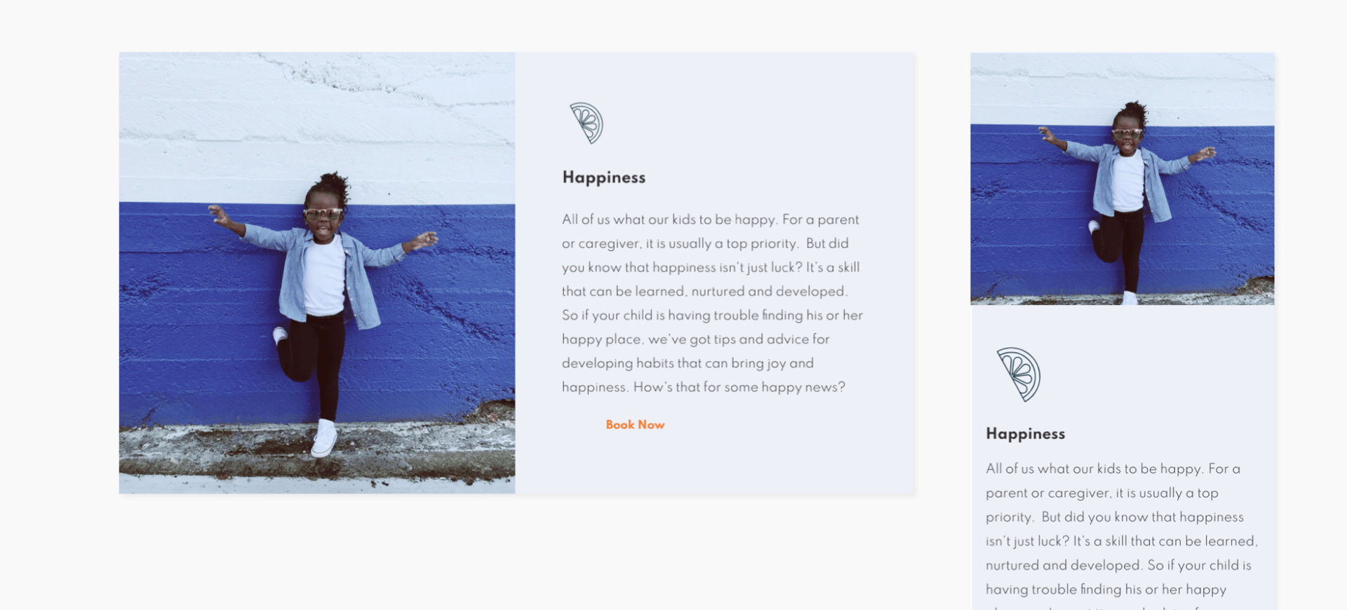
Intro

Text & Image

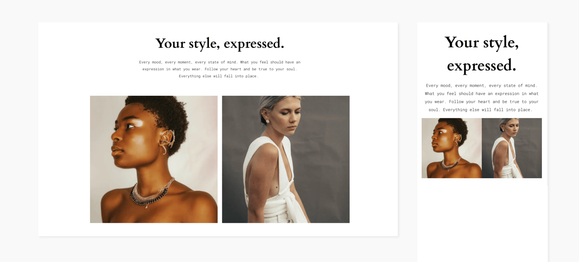
Gallery
Scroll down for instructions and a video on how to recreate this gorgeous section on your own.
Features


Team


Promotion


Text Block

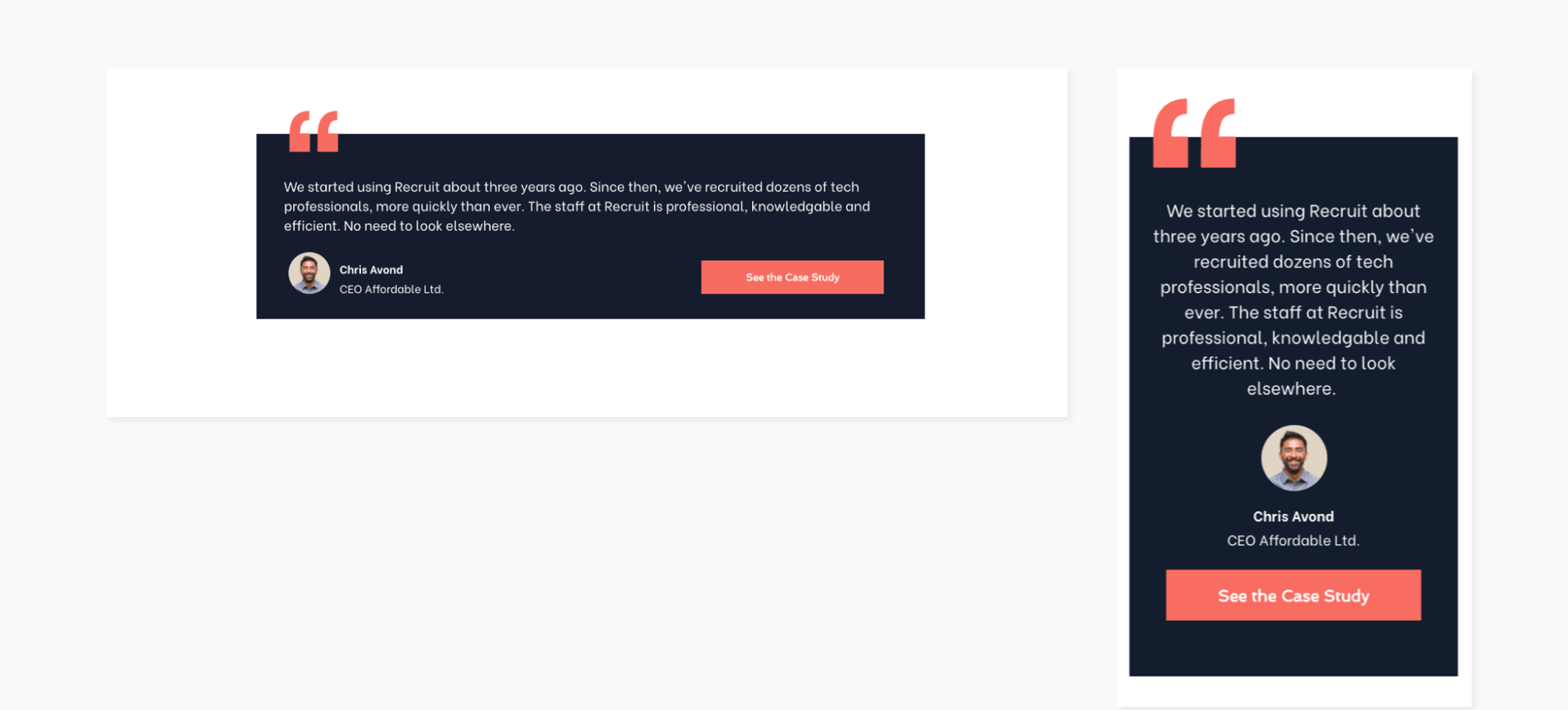
Testimonials
Contact


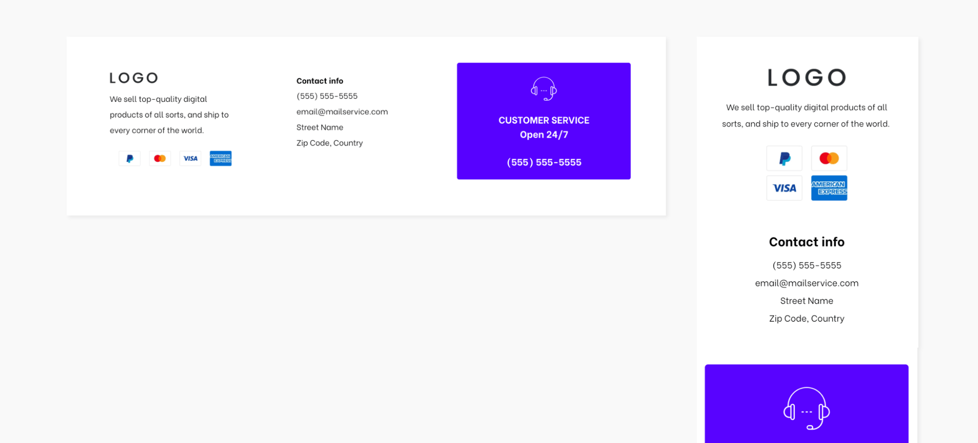
Footer
How to reproduce this gorgeous section

- Add a row. Set the background color to #ffe8db. Set the top and bottom padding to 100px and left and right to 40px.
- Add a text widget with your title (H1) and set the alignment to center.
- Add an inner row with 3 columns. Reset all paddings to 0 and set the top margin to 30px.
In
Column 1:
- Add a background image and set the position to Cover and Center.
- Add a spacer widget and set it to 300px.
- To save time later, go to the mobile version and hide this column, so you get only columns with content. Go back to the desktop view.
In
Column 2:
- Set the background color to #ffffff.
- Set the top and bottom padding to 50px and the left and right padding to 15px.
- Add an image widget. Set the width to 80px and align it center.
- Add a button and add your text. Align it center and set the top margin to 25px.
- To save time later, go to the mobile version. Adjust the image width to 80px, set the top and bottom padding to 50px, and and left and right padding to 15px. Go back to the desktop view.
In
Column 3:
- Add a background image.
- Go to Column 1, copy the spacer widget, and paste it here.
- Go to Column 2 and copy the entire column.
- Paste it to the right to get 4 columns (column 2 & 3 will be identical).
- Switch the order of columns 3 & 4.
In
Column 4:
- Replace the image and change the button text.
- Copy and paste the entire Inner Row (all 4 columns).
- Move up the pasted Inner Row up so that it is flush below the first one. (To do this, right-click on the bottom inner row and, from the arrows in the top right corner, click Move row up).
- Reverse the order of columns 1 and 2, and columns 3 and 4.
- Replace the images and the button texts.
Adjusting for Mobile
Move to the mobile view and adjust as follows:
- In the top row, set the top and bottom padding to 70px.
- In columns 2 and 4, set the top margin to 30px.
Remember: If you've built a section and love it, you can save it and use it over and over again using Team Sections. Your teammates can also use it. Just click Save as Section, give it a name, and it will be saved for future use.
LATEST POSTS