Flex is Now a Lot Simpler
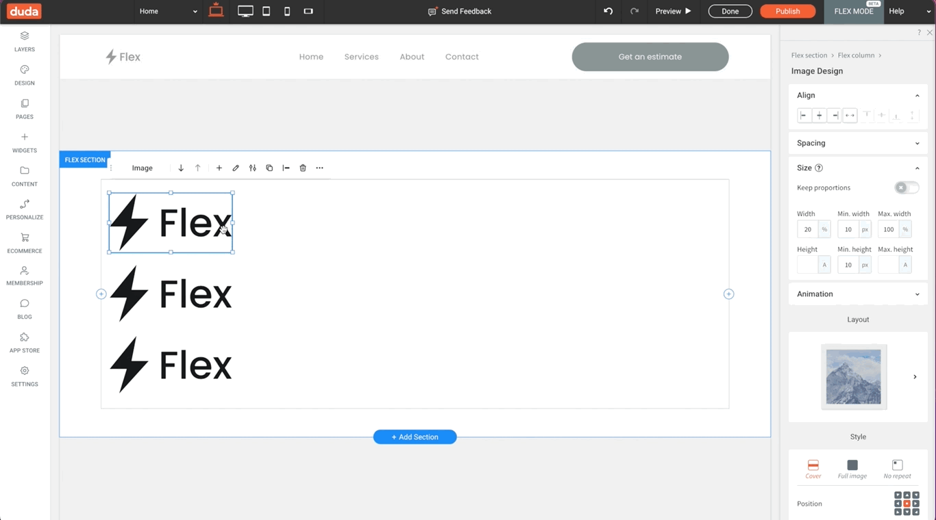
DudaFlex is a lightning fast, fully responsive website building technology using pixel-perfect auto-layouts. It offers exciting site building possibilities to clients, designers and developers.
The new simple Flex version takes that powerful DudaFlex beast and turns it into an easy to use, highly intuitive process - no coding or previous design experience is required. You can start using it to build sites even if you’ve never worked with Flex before.
Why you should use Flex to build sites
Save precious time and build beautiful, pixel perfect responsive websites in a fraction of the time, using the new Flex version.
Here’s how the new Flex can speed up your site building process:
Fully responsive Flex layouts and sections
When you use Flex sections and columns, you only need to do it once - they will auto-optimize their appearance
to look perfect on all screen sizes. Whether desktop or mobile, you can count on Flex to make your design look consistent across all devices. The new Flex version makes it easy to add and delete columns, as well as resize and reorder them inline.

Instantly align anything vertically or horizontally
Flex takes element alignment to the next level. Need to vertically align several elements inside a column so they’re centered and pretty? Flex columns are vertically aligned by default, and you can set the position of all the column’s internal elements together. This perfect alignment will remain the same across all devices, even if you change the height of the section the column is nestled in.

Additional Flex perks you should know about
Thanks to a simple actions bar that floats right above the element you’re editing, you can enjoy quick access to the most frequent actions from within the canvas.
In addition, you can now add space between elements using a simple slider in the design panel.
Go freestyle if you want to
Just in case you’re interested in design options like overlapping elements, you’re still welcome to do so. With the new Flex version, you can use the
Advanced Grid widget. Just add it to your site and play around with freestyle design. Keep in mind though that you should double check the appearance of overlapping elements in different screen sizes. This is to make sure they look good on both small and large screens.
And if you’ve already used Flex before…
Then you’ll be happy to know that the new simple Flex version is super easy to use. You’ll find it more intuitive, and it will speed up your work process. If you gave it a try in the past and didn’t find it useful, now is the time to give it another go.
Where to find the new Flex version?
To use Flex in your next site design, just add a Flex section to a site that doesn’t have Flex yet. Alternatively, you can use a Flex template (look for the
Advanced Templates block on top of the Template selection page).
So what’s next for DudaFlex?
Duda is constantly working to expand and improve its Flex capabilities. Some of the improvements we’re currently working on include adding a Flex header, and making it easy to add the new Flex version to sites that have Flex 1.0. Both of these are coming soon.
Get started with the new Flex version today. If you want to learn more about using Flex, check out
this article.
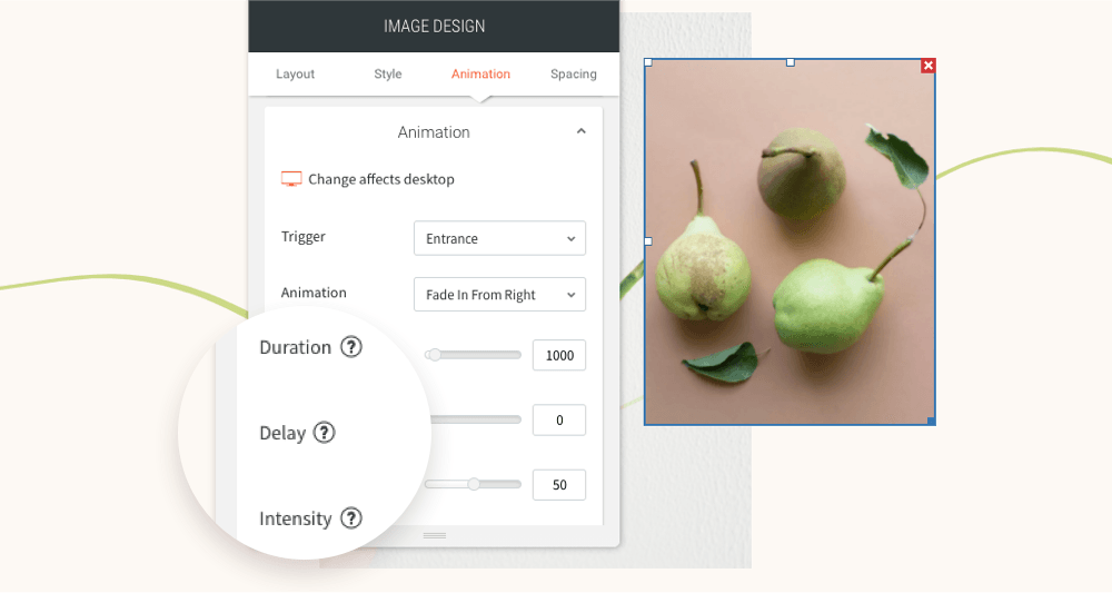
You’ve asked for more animations, and now you’ve got them! In addition to a new animation trigger, you now have powerful animation customizations so you can control how long the animation lasts, how intense it is and more. All of this gives you the flexibility to create fabulous animations on your sites.
Attract attention with fabulous animations
Animations are a terrific tool for engaging site visitors and drawing their attention exactly where you want it to go. Animate buttons you want visitors to click on, services you want them to notice, or images you want them to see.
Accessible directly from the widget design editor, you can now choose from two animation triggers:
Entrance
and
Scroll. Entrance animations are triggered when the site loads; Scroll animations are triggered when the animated area enters the viewport (when visitors see that part of the screen).
As for customizations, you can set:
- How long an animation lasts
- Where it begins and ends
- The intensity of the animation
- When the animation starts
These controls give you limitless opportunities for animating your sites, so you can create the effects that are just right for the tone and style of your site.
Note:
Animations must be set separately on desktop, mobile and tablet.
Animation Best Practices
- Use animations wisely. Make sure the animation you choose fits your site vision and character.
- Set the animation according to the content. If you use a scroll animation on text, for example, make sure you have enough viewport time for users to read the text that's being animated.
- Everything in moderation, including animations. Animations can help you deliver a message, but try not to be too aggressive with them. Make sure your animations feel natural & smooth, without causing discomfort or significant delays for users.
- Be consistent. Don't use too many different kinds of animations in one site.
Ready to get started? Give this sleek animation a try
To get a feel for your new animation controls, here's an example (immediately below) for animating columns that come into the viewport one after the other.
- Click column 1 to open the design editor and click Animation.
- Set the trigger to Scroll and the animation type to Fade in.
- Set the viewport top to 20% and the viewport bottom to 20%.
- Click column 2 to open the design editor and click Animation.
- Set the trigger to Scroll and the animation type to Fade in.
- Set the viewport top to 20% and the viewport bottom to 40%.
- You can create more columns and repeat these steps (adding 20% to the viewport bottom to delay it).
Have more ideas for great animations?
Fill in the form below to tell us about more types of animations you'd like to have.
Contact Us
LATEST POSTS