Responsive Layout
Your sites will look great on multiple screen sizes, including iPad, with responsive layout for desktop/tablet, which enables you to control site layout according to breakpoint (1024 px) rather than device.
It’s already enabled in new sites, and can be toggled on in existing sites.
Easy control over your site layout
Responsive layout means your sites look better on multiple screen sizes, for a better experience for site visitors. This means, for example, that a top navigation header on larger desktops automatically switches to a hamburger menu when the screen size is below 1024px.
Already enabled in all new sites
This new capability is already enabled in all new sites. For existing sites, you can toggle it on via Global Design > Page Layout. Toggle it off any time and your site will go back to the previous tablet view. Mobile view is not affected, and remains determined by device.
For more details about Responsive Desktop/Tablet, see
this.
Want more responsive design options?
Discover DudaFlex, the next-generation editing capabilities now available in any Duda site. For more, see this.
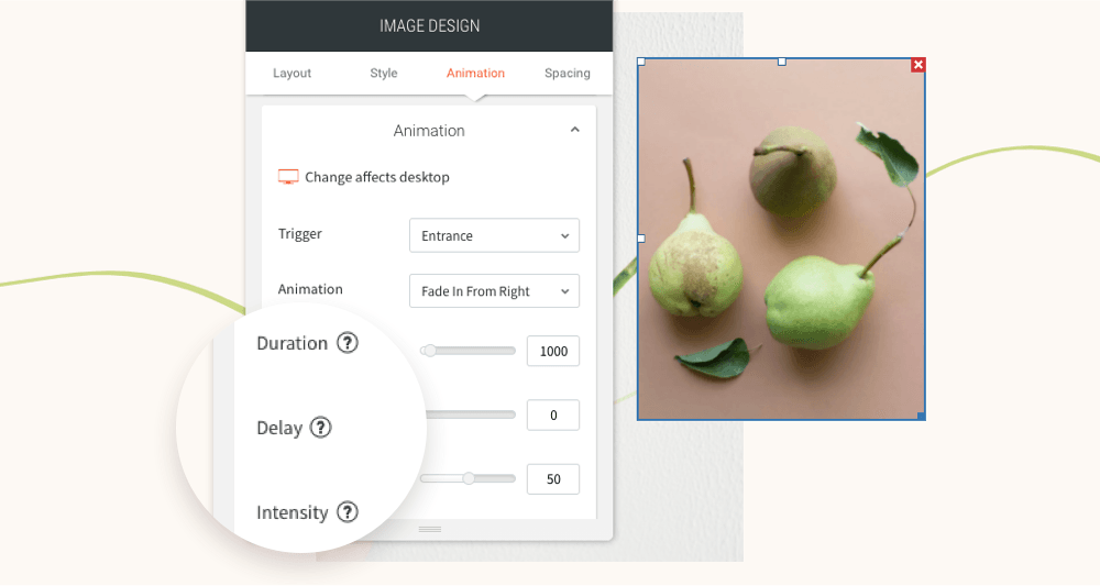
You’ve asked for more animations, and now you’ve got them! In addition to a new animation trigger, you now have powerful animation customizations so you can control how long the animation lasts, how intense it is and more. All of this gives you the flexibility to create fabulous animations on your sites.
Attract attention with fabulous animations
Animations are a terrific tool for engaging site visitors and drawing their attention exactly where you want it to go. Animate buttons you want visitors to click on, services you want them to notice, or images you want them to see.
Accessible directly from the widget design editor, you can now choose from two animation triggers:
Entrance
and
Scroll. Entrance animations are triggered when the site loads; Scroll animations are triggered when the animated area enters the viewport (when visitors see that part of the screen).
As for customizations, you can set:
- How long an animation lasts
- Where it begins and ends
- The intensity of the animation
- When the animation starts
These controls give you limitless opportunities for animating your sites, so you can create the effects that are just right for the tone and style of your site.
Note:
Animations must be set separately on desktop, mobile and tablet.
Animation Best Practices
- Use animations wisely. Make sure the animation you choose fits your site vision and character.
- Set the animation according to the content. If you use a scroll animation on text, for example, make sure you have enough viewport time for users to read the text that's being animated.
- Everything in moderation, including animations. Animations can help you deliver a message, but try not to be too aggressive with them. Make sure your animations feel natural & smooth, without causing discomfort or significant delays for users.
- Be consistent. Don't use too many different kinds of animations in one site.
Ready to get started? Give this sleek animation a try
To get a feel for your new animation controls, here's an example (immediately below) for animating columns that come into the viewport one after the other.
- Click column 1 to open the design editor and click Animation.
- Set the trigger to Scroll and the animation type to Fade in.
- Set the viewport top to 20% and the viewport bottom to 20%.
- Click column 2 to open the design editor and click Animation.
- Set the trigger to Scroll and the animation type to Fade in.
- Set the viewport top to 20% and the viewport bottom to 40%.
- You can create more columns and repeat these steps (adding 20% to the viewport bottom to delay it).
Have more ideas for great animations?
Fill in the form below to tell us about more types of animations you'd like to have.
Contact Us
LATEST POSTS