New Template: Poke Restaurant
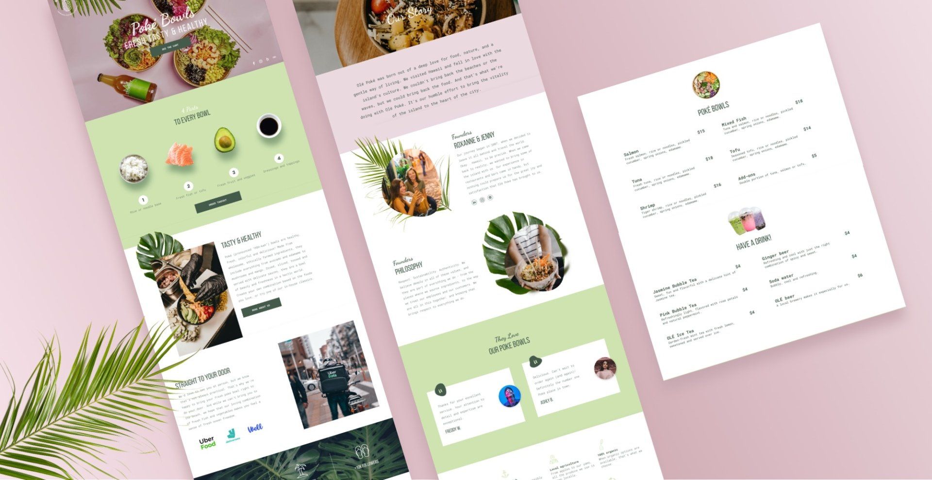
Hungry for a new restaurant template? We’ve got just the thing! The new Poke restaurant template is stylish and fresh, with a breathable layout and cool, positive vibe.
The Poke Restaurant template, designed with takeaway and delivery in mind, has four pages that cover everything visitors expect from a restaurant website: a great-looking menu, company information including socially responsible business practices, testimonials and Instagram. The last two elements are particularly important these days, as they give visitors an authentic glimpse of the real restaurant, right from the website.
The menu page includes the
Menu widget, which can be synced with an online menu, built directly in the platform, or generated by uploading a CSV. If you've got great images of each menu item, you can definitely include them via the widget. For more on using the Menu widget,
see this.
Integrating Takeaway and Delivery
Today, takeaway and delivery options are crucial for every restaurant and this template is ideal for integrating third-party delivery apps such as UberEats, DoorDash, GrubHub, ChowNow and more. Choose the one that operates in your client’s location.
Reproduce the Overlapping Leaf Section in Your Own Sites
Want to recreate the layered look in the Our Story section on your own site? Watch the video below to see how to do it or following the step-by-step instructions, immediately below the video.
Add a row
1. Add a row and make sure the background color is transparent.
2. Set the top spacing to 0px and bottom spacing to 100px.
3. Add an additional column in the row, so you have 2 columns.
4. Slide the divider between the two columns so the ratio of the columns is 1:2.
In the left column
1. Reset all spacing to 0px.
2. Add an image widget. Upload a leaf image with a transparent background. Align it left.
3. Add an image widget below this image. Add a good-quality, vertical image. Align it center and set the top margin to -150px so this image overlaps the top one.
In the right column
1. Add 3 widgets: Title, text and button. Align them left and fill with content.
2. Drag the widgets down so that they sit a bit lower than the image on the left.
Overlap with the row above
1. Go back to the Row editor and set the top margin to -60px so the leaf overlaps the row immediately above this one.
Add animation
1. Leaf image: Right click > Entrance animation> select Fade in from Left
2. Right Column: Right click > Entrance animation > select Bounce in
3. Make sure everything looks just right, then move to the mobile view.
Adjust for mobile
1. Leaf image: Reduce the image size width and align it left.
2. Vertical image: Reduce the width and set the top margin to -140px so it overlaps the leaf image. Align the widget to center.
3. At the row level: Set the top margin to -60px so it overlaps the row above.
4. Adjust the spacing of the sections below to make sure everything looks balanced.


