DudaFlex Improvement: Hide on Breakpoint
Thanks to your feedback, we've developed more ways to hide elements on specific breakpoints. This makes it easier for you to control exactly how sites built in Flex look on different screen sizes.
Hiding elements on breakpoints
Hiding elements per breakpoint is a great way to make sites look just right on every screen size. For example, a complex design that looks perfect on desktop may seem cluttered on a smaller screen size. Hiding elements allows you to adjust a design per breakpoint, so it looks great on every screen.
To making this easier in Flex, we’ve added more ways of hiding elements:
1. From the layers panel, locate the element you want to hide and click the eye icon.
2. Right-click on the element to display the context menu and select Hide on this breakpoint.
3. Click on an element to display the floating bar, then click the snowman icon (3-dot icon) on the right to reveal the menu and select Hide on this breakpoint. (Note: This method is not yet available for Grid, Container and Flexbox elements.)
You can also hide an element using keyboard shortcuts: Shift+Command+h for Mac. Shift+Control+h for Windows.
Note: To show an element that's been hidden, open the layers panel and click the eye icon.

Keep sending your feedback
Thanks to your ongoing feedback, we’re improving DudaFlex all the time. Tell us what you think via the Send feedback button you’ll see in Flex mode, or via the form below.
Contact Us
Haven't taken the Duda U DudaFlex course, yet?
Now’s the time! It’s free, on-demand, and sure to improve your DudaFlex skills in no time!
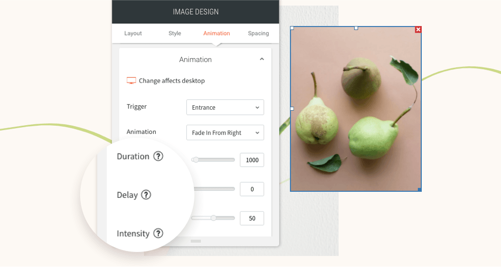
You’ve asked for more animations, and now you’ve got them! In addition to a new animation trigger, you now have powerful animation customizations so you can control how long the animation lasts, how intense it is and more. All of this gives you the flexibility to create fabulous animations on your sites.
Attract attention with fabulous animations
Animations are a terrific tool for engaging site visitors and drawing their attention exactly where you want it to go. Animate buttons you want visitors to click on, services you want them to notice, or images you want them to see.
Accessible directly from the widget design editor, you can now choose from two animation triggers:
Entrance
and
Scroll. Entrance animations are triggered when the site loads; Scroll animations are triggered when the animated area enters the viewport (when visitors see that part of the screen).
As for customizations, you can set:
- How long an animation lasts
- Where it begins and ends
- The intensity of the animation
- When the animation starts
These controls give you limitless opportunities for animating your sites, so you can create the effects that are just right for the tone and style of your site.
Note:
Animations must be set separately on desktop, mobile and tablet.
Animation Best Practices
- Use animations wisely. Make sure the animation you choose fits your site vision and character.
- Set the animation according to the content. If you use a scroll animation on text, for example, make sure you have enough viewport time for users to read the text that's being animated.
- Everything in moderation, including animations. Animations can help you deliver a message, but try not to be too aggressive with them. Make sure your animations feel natural & smooth, without causing discomfort or significant delays for users.
- Be consistent. Don't use too many different kinds of animations in one site.
Ready to get started? Give this sleek animation a try
To get a feel for your new animation controls, here's an example (immediately below) for animating columns that come into the viewport one after the other.
- Click column 1 to open the design editor and click Animation.
- Set the trigger to Scroll and the animation type to Fade in.
- Set the viewport top to 20% and the viewport bottom to 20%.
- Click column 2 to open the design editor and click Animation.
- Set the trigger to Scroll and the animation type to Fade in.
- Set the viewport top to 20% and the viewport bottom to 40%.
- You can create more columns and repeat these steps (adding 20% to the viewport bottom to delay it).
Have more ideas for great animations?
Fill in the form below to tell us about more types of animations you'd like to have.
Contact Us
LATEST POSTS