Add Custom Fonts & Google Fonts - Quickly and Easily
‘Tis the Year of Typography! And you’re ready for it with your new Add Google & Custom fonts capability, which enables you to quickly and easily add fonts to any site. With limitless font possibilities, you can use distinct or brand-specific typography to emphasize and attract more visitors to read the site content.
Note: This capability is available for new sites only right now.
Typography: A Simple Way to Say So Much!
Site typography has a huge impact on site visitors. At a glance, the fonts you use convey the mood and tone of the site, anything from casual and playful to serious and exclusive.
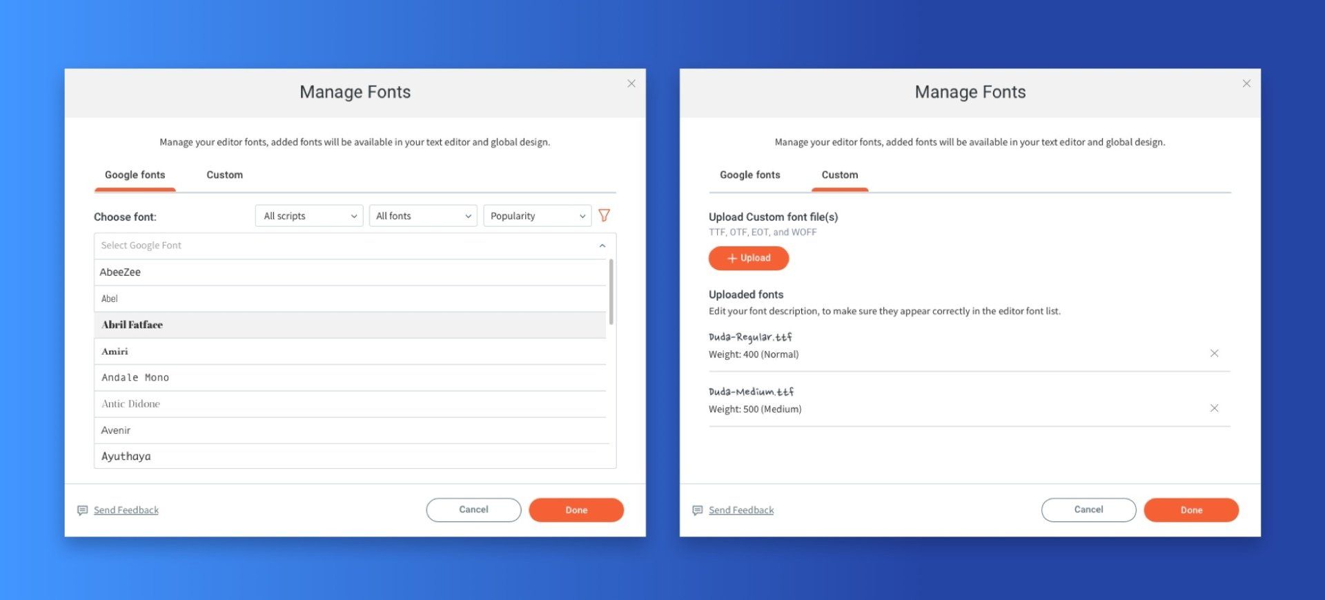
With your new Add & Manage Fonts capability, you can upload an unlimited number of fonts to your site, including any Google font (you’ve got 1000s to choose from!) as well as any custom font that you have the rights to use.
The font upload process is easy and quick, and once a font has been added, it’s accessible in every text element on the site, as well as in the Global fonts.
Note: We’ve reduced the number of default fonts automatically loaded to each site, so the editor loads faster.

A Few Typography Tips to Remember
Web trends are changing and so are the types and ways people use fonts on their sites. Still, some best practices remain the same. These include the following:
Use two (maximum three) fonts in a single website.
Too many fonts can be distracting and unattractive. Use a single font for paragraphs and general texts; use no more than two fonts for titles. We recommend adding them to the global design so it will be consistent throughout the entire site.
Whatever fonts you choose, make sure they are easy to read.
Nothing is more frustrating for a site visitor than having to make an effort to read what’s written on a site. So make sure your fonts are big enough and clear enough. And make that the contrast between the background and the text is distinct enough so it will be easy to read.- Serif fonts tend to be more serious; san serif Sans serif ones tend to be more relaxed. Serif fonts have little feet attached to the ends of the letters and tend to look more formal. Sans serif fonts don’t have the little feet on the ends of the letters and they tend to look more contemporary.
Great Font Resources
If you’re just getting started with fonts and typography, here’s an
excellent beginner’s guide from Google. For more advanced reading, see
this.
To explore the huge range of fonts available to you through Google, go directly to Google Fonts.
LATEST POSTS