Blog Post
Roni Landau • Jan 18, 2018
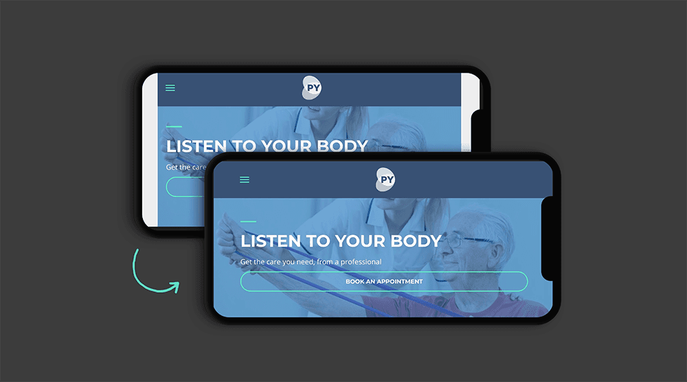
Your Sites Optimized for iPhone X
Duda sites are now optimized for the iPhone X edge-to-edge display.
The edge-to-edge display, one of the most exciting aspects of the new iPhone device, provides viewers with an incredible viewing area. It also presents a challenge for website displays, as the notch at the top of the device means non-optimized sites viewed in landscape mode will display white margins on the left and right side, to accommodate the notch without compromising the website.
We optimized every site by using a new viewport descriptor provided by Apple and adjusting the site CSS to be aware of the notch. This ensures that every Duda site looks great on the iPhone X, in both vertical and landscape modes, and displays beautifully on the edge-to-edge screen.
LATEST POSTS
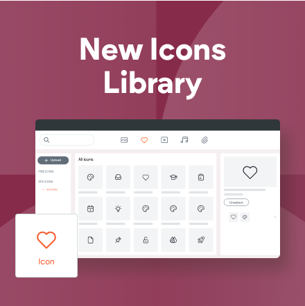
Over 5 million free icons for you to choose from, and a place to upload your own.
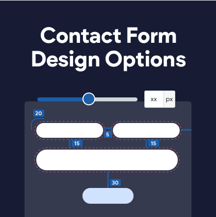
New spacing controls to help you customize the form the way you want to.
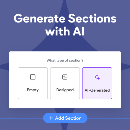
Cut your design time with this brand new AI-powered feature.
Proudly built on the Duda Responsive Website Builder